Context
Opus runs dozens of construction projects in parallel for corporate clients — real-estate developers, mining companies, industries. Each client had a different point of contact: email with the site manager, phone calls with the director, monthly PDF reports. There was no single place for the client to know the real status of what was being built.
Opus Client was created to solve that: an institutional app where the client logs in and sees every project with updated status, talks directly to Opus through chat, and follows what’s happening in the sector.
Goals
- Make project progress transparent for the end client.
- Reduce communication noise (email, WhatsApp, phone) into a single channel.
- Position Opus as a content reference in the sector through an integrated blog.
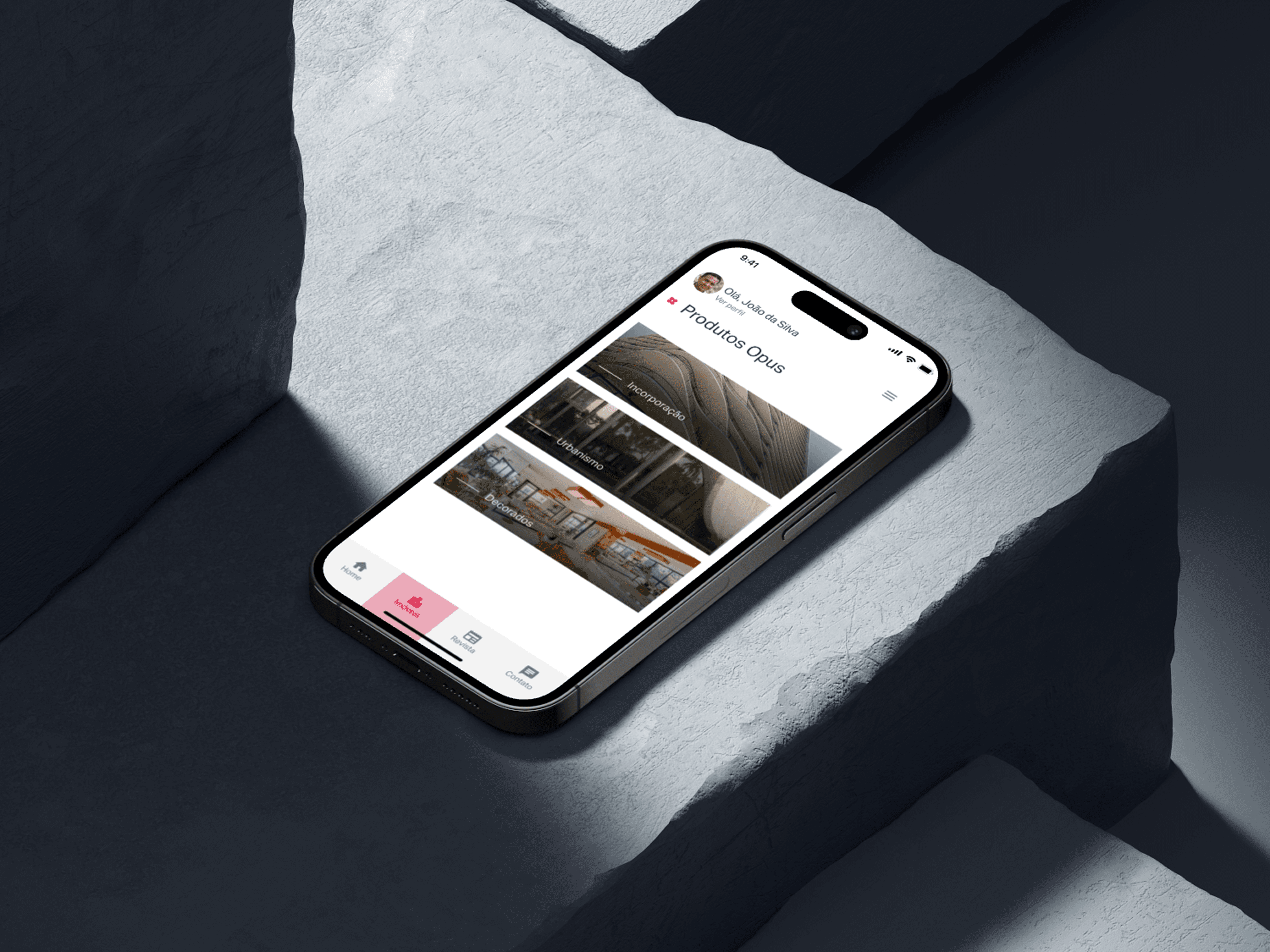
- Let the client navigate the entire portfolio — featured, ongoing, and completed projects.
Research
I interviewed eight active Opus clients across different profiles (head of operations, project manager, CFO). The most recurring blockers:
- “I don’t know what stage the project is at without calling the manager.”
- “The report arrives at the end of the month — too late to correct anything.”
- “When I need to talk to Opus, I don’t know who to reach.”
And one quote that became the project’s compass: “I want to open the app at lunch and see today’s photo of the site.”
Architecture
I structured the app in four main areas, accessible from the bottom nav:
- Home — editorial highlight: project of the month, recent updates, latest blog posts.
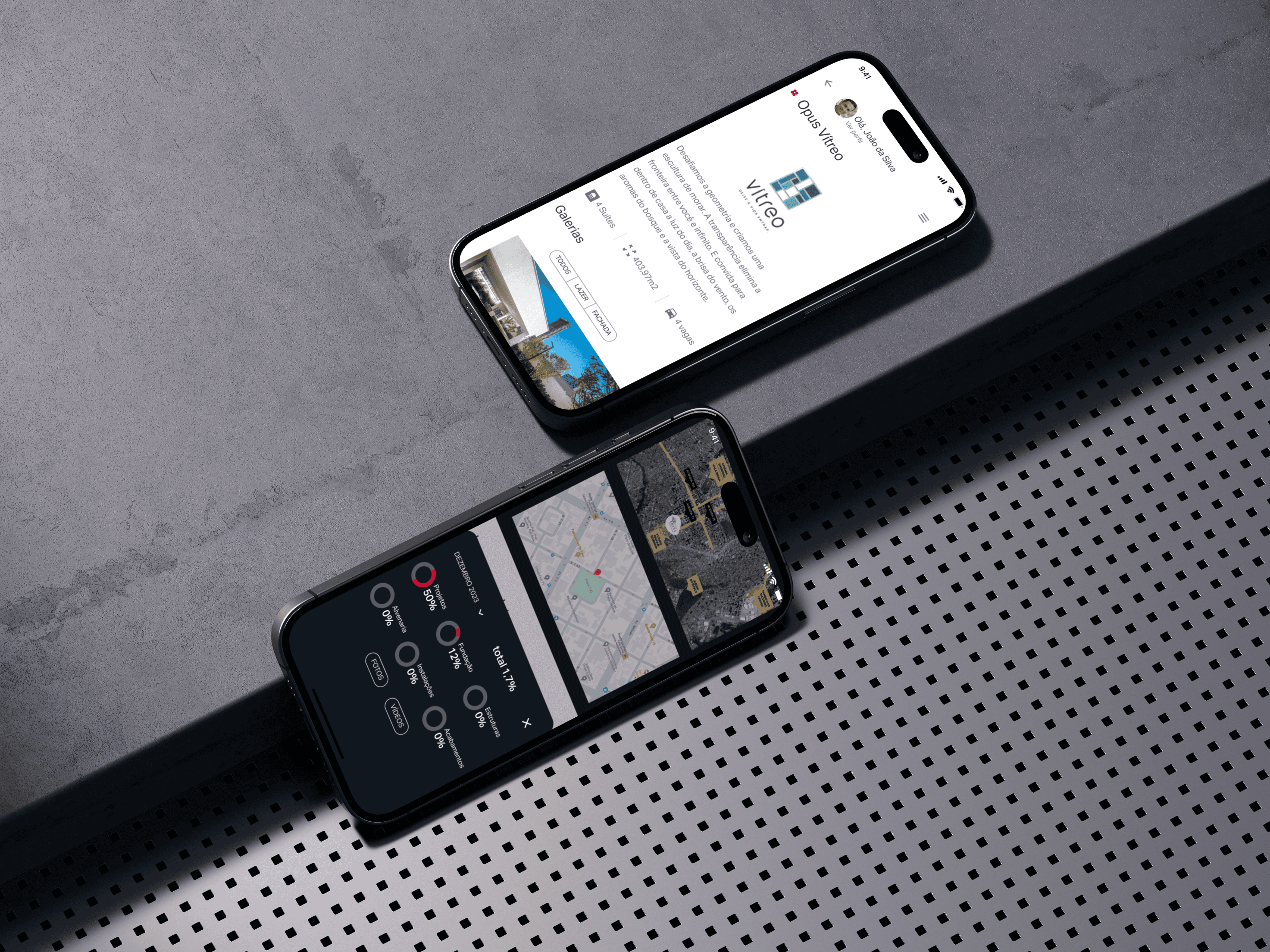
- Projects — full navigation across every client project, filterable by status (featured · ongoing · completed). Each project has a milestone timeline, a photo gallery refreshed weekly, and progress indicators.
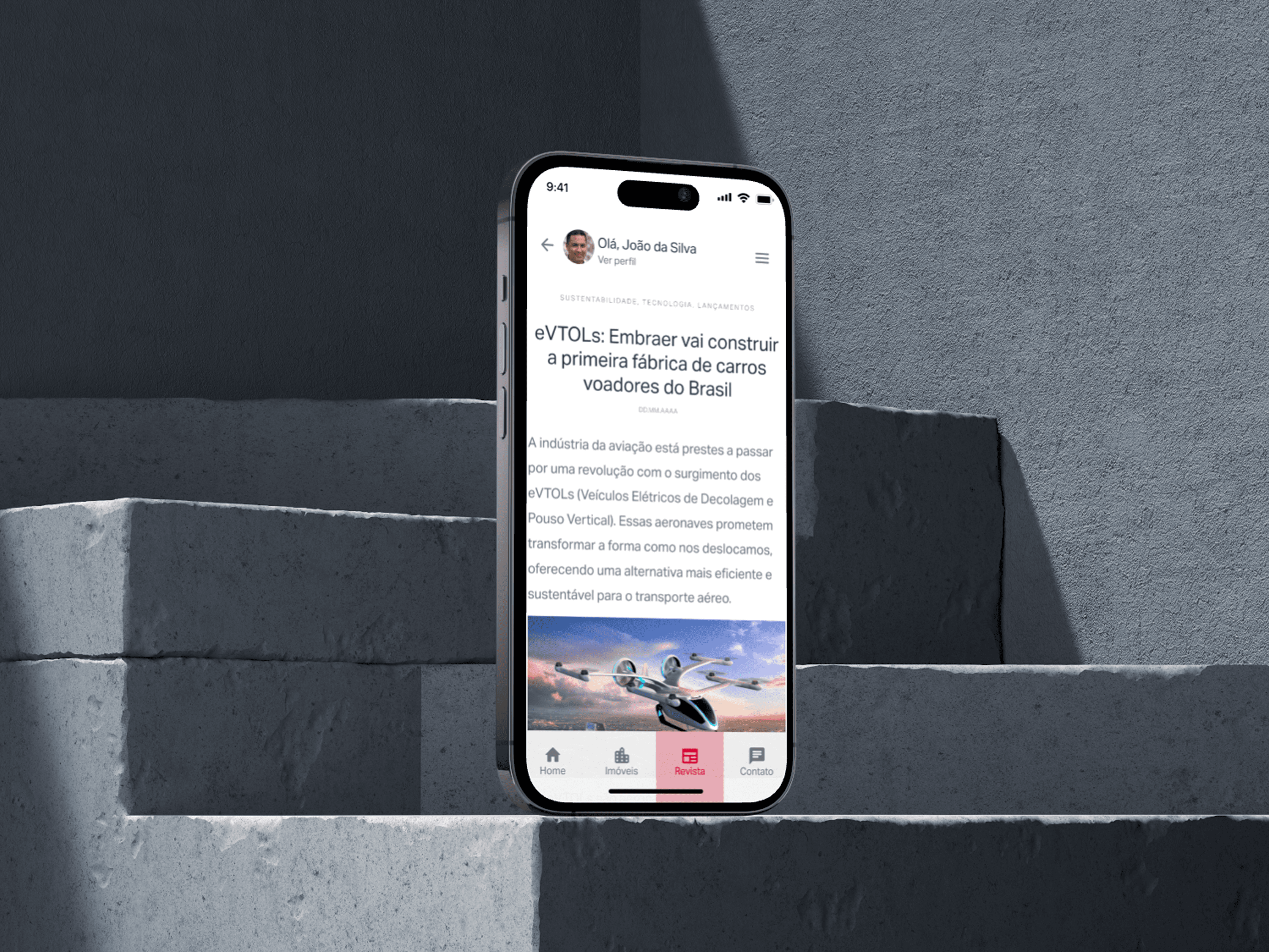
- Blog — Opus editorial content about the sector: construction trends, regulation, sustainability, case studies. Technical authority positioning.
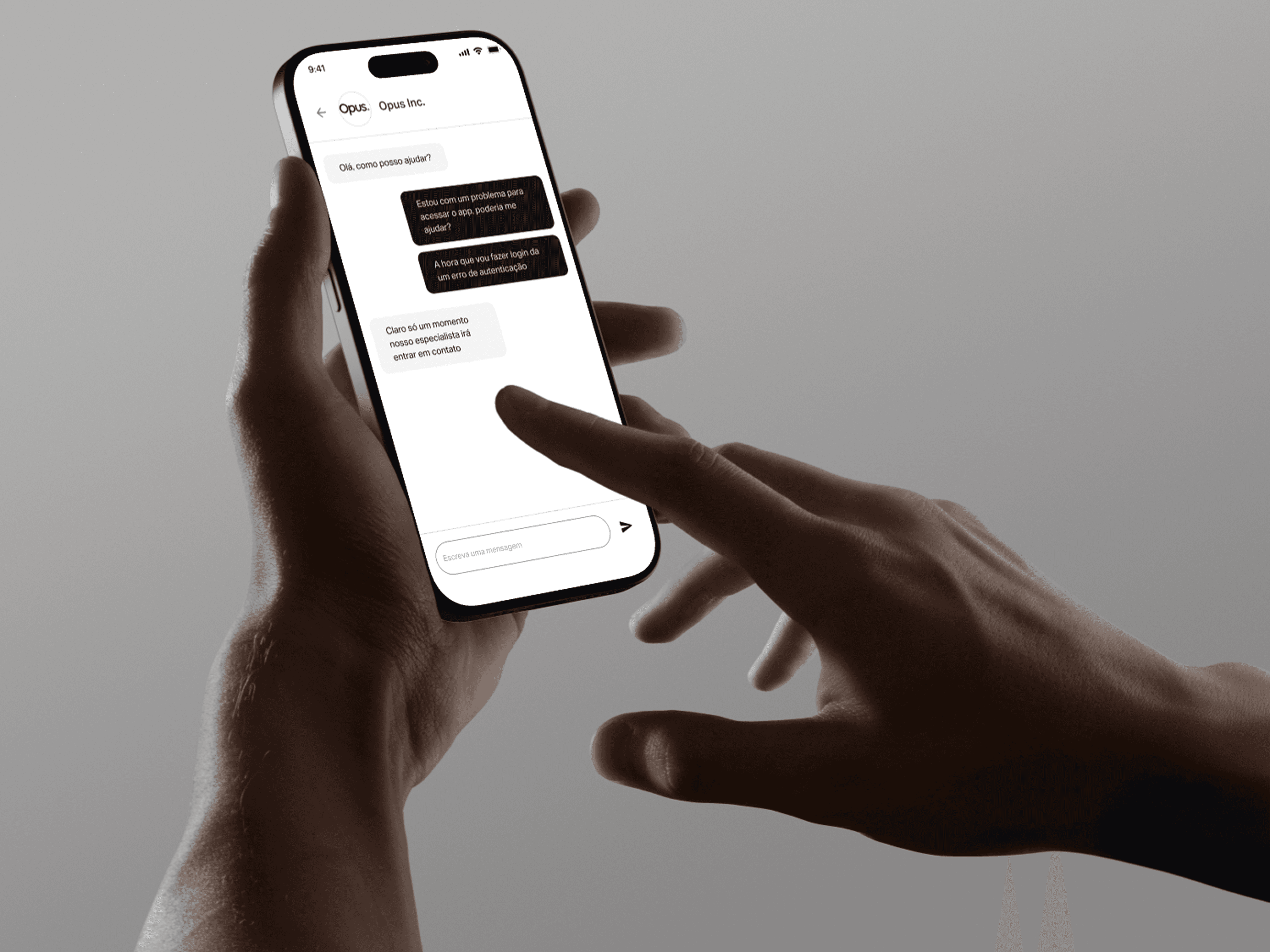
- Chat — integrated chat directly with the Opus account team. No queue, no ticket protocol. Supports photo and location attachments.
Design decisions
Visual project status. Each project shows a colored badge — Featured (black), Ongoing (green), Completed (gray). The user understands the portfolio state at a glance without reading.
Timeline instead of progress bar. On large projects, “73% complete” tells the client nothing useful. I replaced it with a milestone timeline showing planned vs. actual dates — the client sees what happened, what’s coming, and where the delay is.
Chat with a human identity. The chat displays the avatar and name of the Opus person replying — no bot, no “Opus Support”. It strengthens the relationship and reduces the “am I being ignored?” anxiety.
Blog as content, not corporate brochure. The blog isn’t about Opus — it’s about the sector. Posts cover environmental regulation, new construction techniques, market trends. Opus shows up through curation and depth, not self-promotion.
Outcome
- +340% in chat message volume vs. previous email channel — clients engaged more actively.
- Average response time dropped from 14h (email) to 1h40 (chat).
- NPS 68 among corporate clients after three months.
- Blog reached 12,000 unique reads in the first half, becoming an inbound acquisition channel.
The app became part of Opus’s contractual onboarding. Today, every new client gets access on day one of the project.